Jersey Design and YOU!

Designing the jerseys of tomorrow, today!

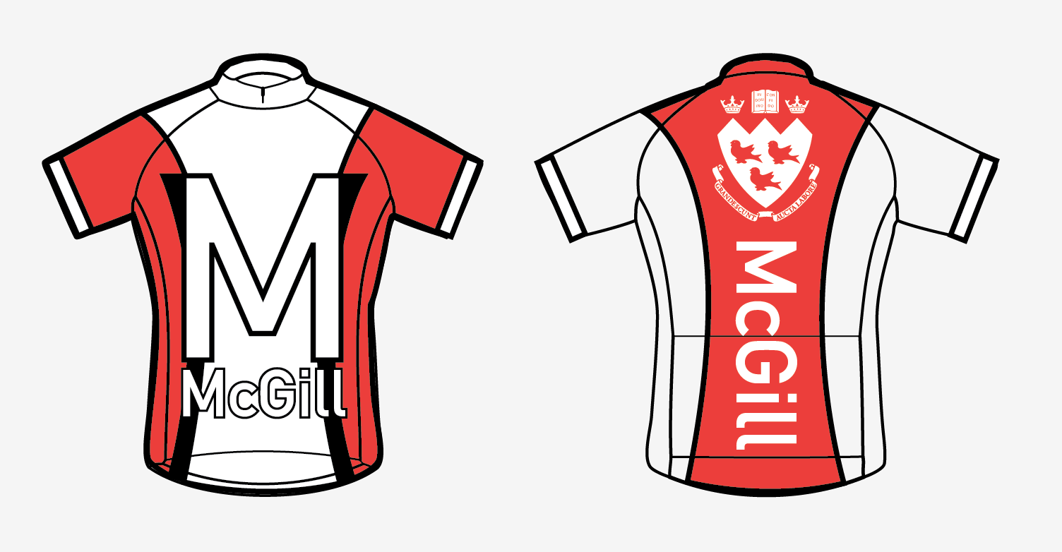
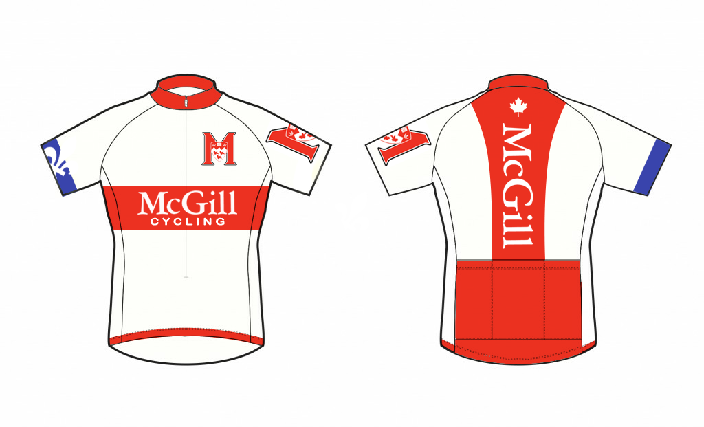
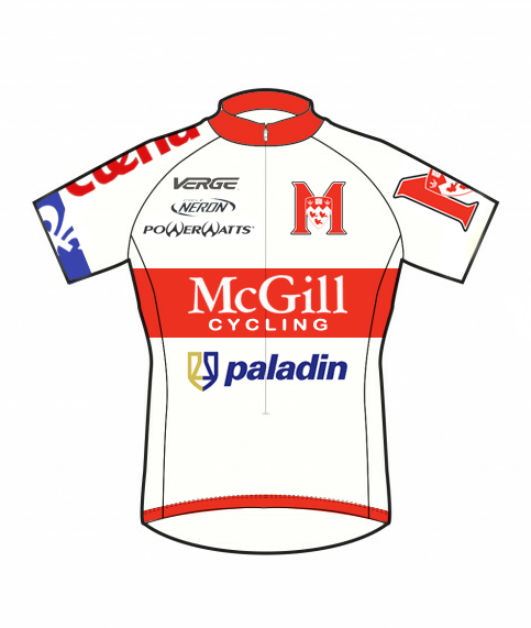
Are you afraid that the new era of kits will look this this, this, or this?

Here’s the skinny: I believe that the jersey & bib design that gets chosen this year will be used for at least two, if not three years. We’re looking for something awesome, tasteful, modern (then again, classic designs are cool too), quick, powerful, eye-catching, etc., etc.

The basic point is that we’re looking for kit designs, and we want to see what you can come up with! If having an entire collegiate club & team wear your art is something you’d be interested in then please submit some drawings! Submissions should go to jerseys@mcgillcycling.com

Submissions can be in whatever format really (avoid ascii art, please) and should be in by Friday May 18th, 2012. Why so early? We want to get this ball rolling quicker so we can have the kits in earlier in the fall semester.

Here’s a run down:
What: Give us your McGil Cycling jersey & bib design
Why: Because it’s cool
CHANGED (to) Where: jerseys@mcgillcycling.com
When: Friday May 18th, 2012
How: MS Paint, photoshop, hand-drawn & scanned, however as long as it’s clear

I may have forgotten to include some jazz in this post in which case I’ll just append it as a reply to this post.

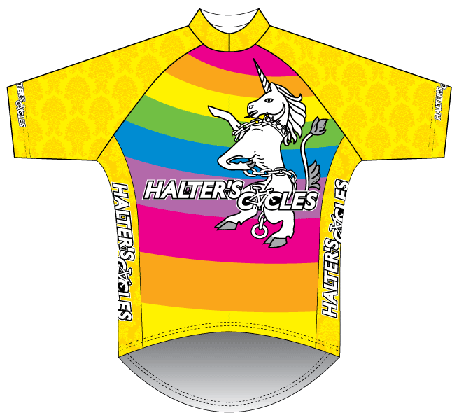
(Other assorted ridiculous jerseys below)

National pride
You must go to the Dagobah system
Count Chocula & Friends?
But I don’t like…
I don’t even know

Guidelines -

-McGill Colors are Red and White (Go figure right)
-We would like to try to put some blue into the design to represent that we are in a Francophone Province
-We can use the McGill Athletics M but NOT the plain crest.
-Remember to think about how good the design looks on bib+jersey, a skin suit and a pelta jacket.
-Put in places where you would like to see our sponsors (label it Sponsor 1,2,3 in order of how much money they give us)

I hope these help you all design something awesome.

Adam.

Yes, it’s important that it’s a sponsor friendly jersey but I don’t want it to look like this…

Also, really recognizable shoulders. That’s most of what you see when you look back or spectate. It’s important to be able to recognize your team mates. The back too so you know when your friend’s on the front. And don’t go to help out a U. Boston guy.

is there a prize?

do u have a company to make the uniform? my good friend Leonardo is in charge of BIEMME north america, i can get u guys a really good price.
we just order the kits for my team in LA so i have a lot os samples if u guys want to check it out, also another great company is Champion Systems, the jersey is nicer in champion but the shorts r way nicer from Biemme, both of them have designers at no extra charge and they actually do a very good job all u need to do is send the logos and colors.

by the way david, is going to be hard not to make it look like the Androni Giocattoli since that team has 12 sponsors and you guys have 9, if u make the logos too small to have a cleaner jersey, will your sponsors be happy about that?

I have a friend who’s in graphic designing and was open to giving it a try.

I’m just wondering if we have a sample of what our current jerseys look but online.

Also a bit more information on what % will be for sponsors and where they have to go because he knows nothing about cycling, and I can’t honestly say I’m not on the same boat!

Well like I said, I have a friend who’s rather talented and studying graphic design who is WILLING to help…

I just need to give him instructions on what it should look like, and especially where the sponsorship logos go and how many of them.

idea sent

Alright Ben!

Everyone send in your thoughts and sketches! This is a very special opportunity to have the team wearing YOUR jersey design! Let’s see some creativity!

Instructions on what it should look like: We don’t know, that’s why we’re doing this. Make it red, have some white, maybe put in some blue detailing.

Where sponsors should go: Anywhere that’s visible. Orica GreenEDGE has got the right idea. Big sponsor spot is really obvious while little sponsor spots are also visible.

We’re likely to tweak any design a bit in order to make the sponsor spots fit best with A) Who the sponsors are and B) Our vision of what the sponsorships should do

Hey,

This is my friend’s first attempt at the jersey… I think it’s bad ass.

I realize we can’t use the crest so we can always get rid of it and replace it with something, or remove it and move up the McGill.

Edit: What does everyone think…

He’s willing to make any neccessary adjustments, so feedback is more than welcome.

Sponsors go where?

I guess anywhere… There’s quite a bit of empty spaces.

Again, it was just his first try at it… He’s willing to help and will make changes.

Still taking designs?

At least until tomorrow evening…

I’m a sucker for clean looking jerseys, so I made this based heavily off of Garmin/Sky.

Front & back:

Preview with sponsor logos:

Jason, your minimalist design looks great! I’m just not sure if we should be using the Maple Leaf as we are not a national team, or the Fleur de Lys, since that tends to be reserved for the Quebec jersey.

We’ve had the maple leaf in the past, UDM have the fleurs de lys; so long as it’s not the main pattern on the jersey, I doubt it’s a problem. I think it’s mostly nice to have since much of our racing is in the States.